Meet the artist: Pref
We caught up with Pref, who designed our London Mural Festival logo, to find out more about his journey into street art, and his fascination with graffiti and wordplay...
What was your journey to becoming an artist?
Well, it’s a bit stereotypical, but I was one of those kids that was always drawing. I wasn’t that academic, so I knew from an early age I wanted to work in the creative world. I went down the graphic design route, studying at Chelsea College of Art, and when I graduated worked for Wonderland, a fashion magazine, designing the first 15 issues. That was a great job and I really fell in love with the science of graphic design and typography – I enjoy being methodical and fastidious about detail (which helps as a mural artist!) I didn’t have a computer in the first year of my degree, which is crazy to think about now – year one I was doing everything traditionally, drawing with pens and photocopying. When I first got my computer it opened up a world of creative possibilities!
So after that, I started my own creative agency doing branding and art direction for the fashion industry, but I was always painting graffiti and murals on the weekend – I’ve been into graffiti from a really young age, so it was something I always kept up. I ended up kind of burning myself out running the agency and then doing all my own creative projects in the evenings and weekends. And that’s when my mural projects were really starting to take off! So I decided to start focusing more on my work as Pref, but it took about five years of balancing both before I could focus on my art full time.
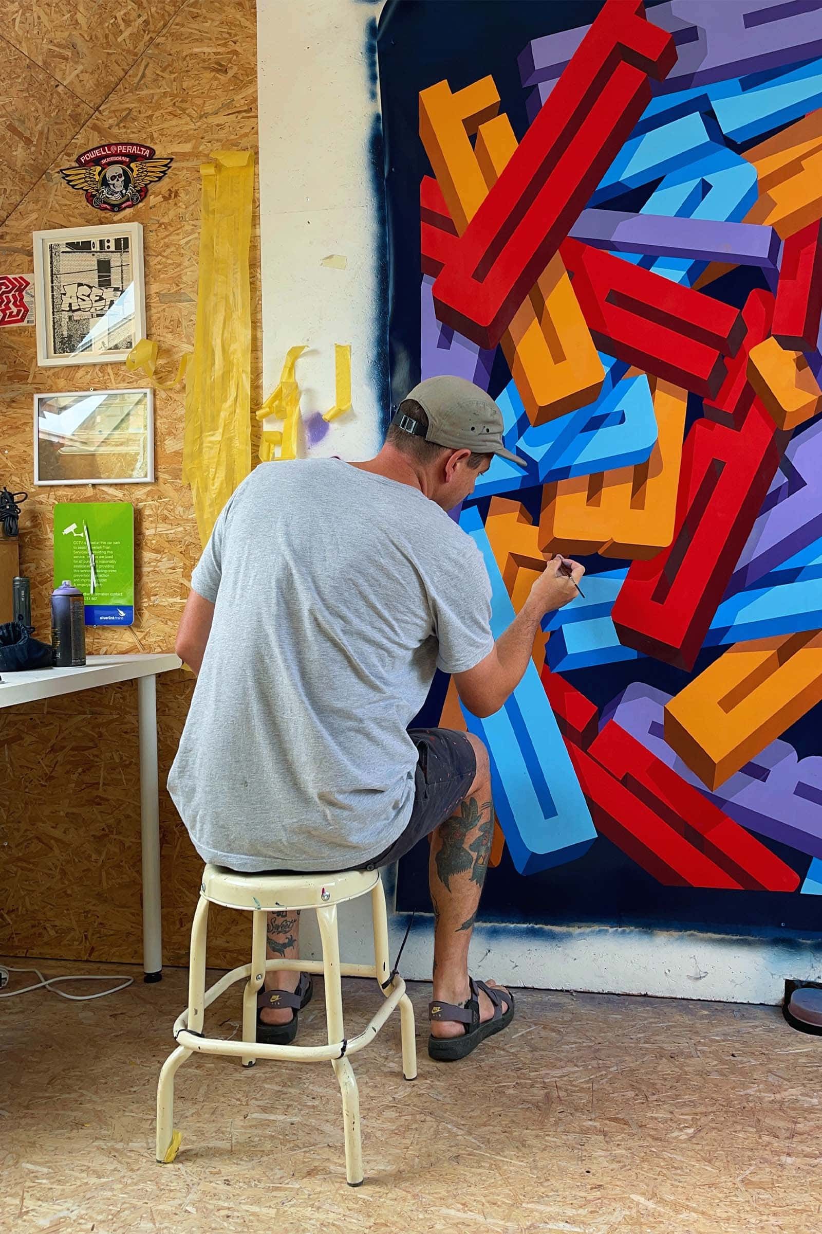
Pref in his studio
What attracted you to graffiti? When did you first pick up a spray can?
I grew up in North West London so I was always surrounded by graffiti – we’re fortunate to have a very rich history of it in London and by the time I was a teenager in the 90s, graffiti was everywhere. I bought a secondhand copy of ‘Spraycan Art’ for 50p - it was a famous graffiti bible. And it just blew my mind – I was hooked! As well as the graffiti pieces, it showed the taggers in their homes – there was no internet back then so this book was really the only window into this scene all over the world. I would take the tube to school when I was about 11 or 12 years old and there’s a section of overground track between Kilburn and Finchley Road that was always changing with graffiti, so I was able to connect the dots between what I was seeing in the book and what was popping up in the world around me.
I loved graffiti because it was an exciting artistic medium I could push myself with – I would set myself aesthetic challenges with it - it wasn’t the vandalism aspect so much. I just wanted to do something unique and different. When I found graffiti, it was this really heady mix of stuff, it’s anti-establishment, with an element of daner, it’s got all these characters and references to satire, cartoons, music. It was such a different scene back then – it was quite mysterious – everything was DIY so you had to make your own pens and inks, you had to know someone who knew where to get certain brands of spray-paint and tricks like using the nozzles from hairspray cans to get different lines, stuff like that!

“I want the viewer to stop and think and make up their own mind”
You’re interested in the play of meaning between words and image – can you tell us more about your design process – what comes first?
It depends really – I either have wording I really want to use and then it’s about finding the visuals to bring it to life, or I have a visual and need to find the wording - so it can start from either way. I’ve been taking a detour in my work for the last couple of years - I used to work with really short statement words, concise, small, things you can paint in a day, but recently I’ve been trying to use really long words and see what I can do with that. Wording and language is very much part of my sense of humour – I’m always interested in language so I often note things down. Stuff that makes me laugh, stuff that makes me think - that I might use in an artwork. My practice is always moving and changing, and often reflects what’s going on in my life or what’s going on in the world at the time – but I never want things to be too explicit, I want the viewer to stop and think, and make up their own mind.
You’re the artist behind our logo - what was your inspiration for it?
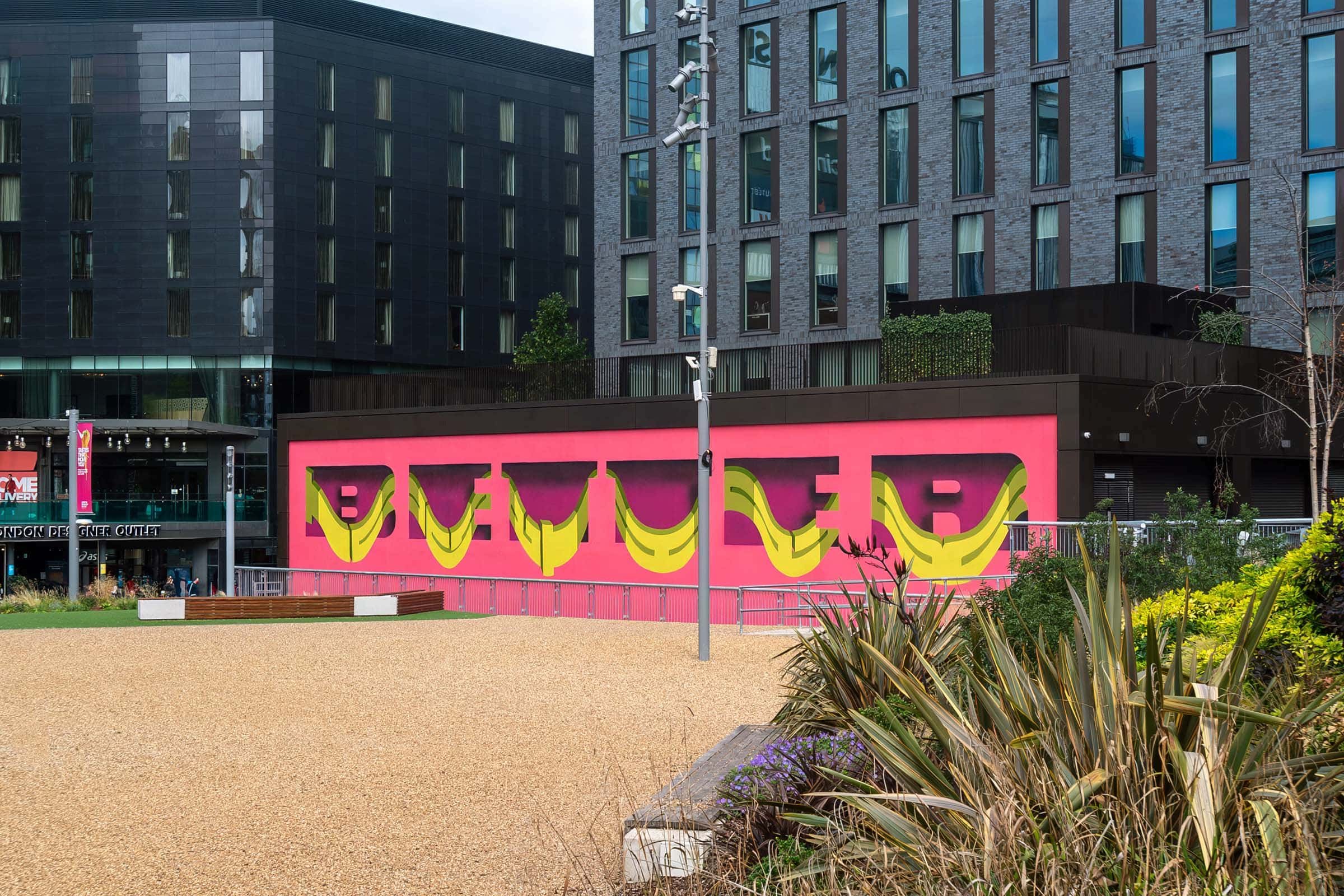
I designed the logo back in 2020 for the first London Mural Festival – the main thing I wanted to achieve with it was that it felt like a wall – a curving wall – that’s the 3D element, in some of the original iterations of it I’d drawn brick as well. The wave that it takes, the reverse S shape is quite indicative of the stuff I was doing at the time. The most important thing obviously for a logo is that it has to be really legible, so it was important to balance something that felt unique and playful, but instantly readable.
The other thing was the idea of movement, I was exploring if the wording could feel kind of like a train, weaving through London – but in the end we went with something more simple.
“I was exploring if the wording could feel like a train, weaving through London”

You’ve painted so many projects, all over the world. What is your favourite mural you have painted, and why?
Probably the one I haven’t painted yet ha…I’m always looking to the next one! But last June I did a mural in New York right by the Brooklyn Bridge which was like my dream scenario – you can see it from the bridge and from the BQE road that runs right next to it and it’s huge. Martha Cooper came to photograph me doing it, and we got to go and hang out with her afterwards. Looking back I think that will always be one of my most incredible projects – you don’t get much more of an iconic site than that!
You painted Better Together for the first London Mural Festival in 2020. What was your favourite thing about taking part?
For me it was getting the chance to paint by Wembley Stadium! Growing up, I could always see the arches, it was iconic! In 2020 we were in the midst of the pandemic so it felt like we needed a statement like ‘Better Together’. The mural also celebrates the diverse community of Brent, which is London’s most multicultural borough. In terms of the design, I already had the concept of the letters of one word acting like a hole and then the other wording weaving in and out of those holes, and when the wall presented itself it felt like the right opportunity to try that.
Whilst I’m from London, most of my murals are in other cities, so being able to produce permanent work in London was really important to me. London’s architecture doesn’t necessarily lend itself to murals – everything’s so close together and cramped, you don’t get that sprawl of say LA or some European cities with newer architecture, so it was a real joy seeing London get painted in a way I never thought it could! I’m really excited to see what the team do for the second edition – with over 100 murals planned it’s just really exciting!

What are you working on at the moment? What does 2024 have in store for Pref?
At the moment I’m doing a project in a secondary school in London, and the mural has been designed with the kids – as I want it to reflect what they want it to say. It’s ended up being a statement from one kid who actually didn’t want a mural in the school, he said ‘I’ve seen enough words’ – which I thought was completely genius!
I’m working on some bespoke sofas, and a mural in Germany by the Nürburgring racetrack. I’ve got a project coming up for the iconic Hospital Club in London, the second edition of London Mural Festival (of course!) as well as some exhibitions…I keep busy!
Thanks so much Pref!
Stay up to date with festival news and announcements in your inbox - sign up to our newsletter below.


